Views Guide
The views are XML files which configure the Transactions and Work Items display.
Thus, you can with a view add, update, order … the searchable fields and the viewable data grid headers.
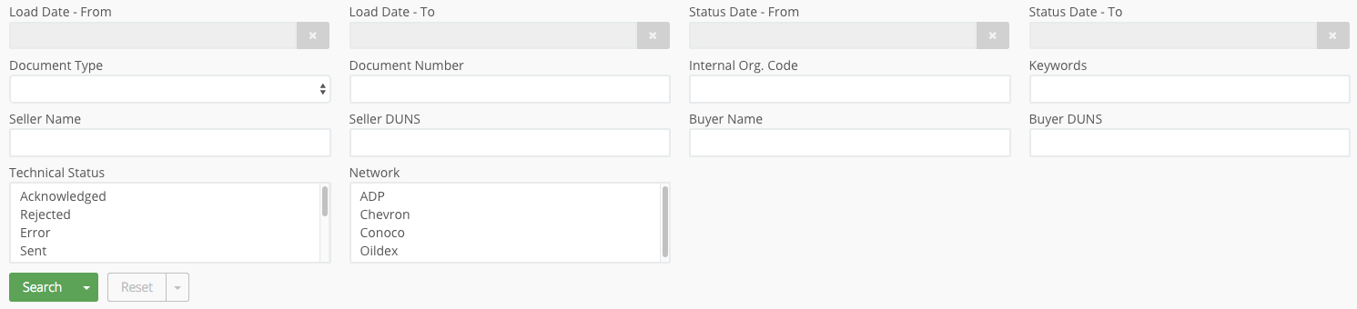
Sample display
For more information about the user interface, read the guide Views user interface.
Reprocess route Uri
To allow the Transactions user interface to reprocess transactions using the P6route component you must add the endpoint uri of the route definition to send the transaction for re-evaluation.
This is done using the element ReprocessRouteUri in the XML configuration.
Example
<View>
    <Name>Transactions</Name>
    <Description>
       <EN>Transactions</EN>
    </Description>
    <ConceptName>TransactionInfo</ConceptName>
    <DataModel>TransactionInfo</DataModel>
    <ReprocessRouteUri>direct:p6router.Hub</ReprocessRouteUri>
</View>
Searchable fields
To customize the Transactions/Work Items UI search behavior, you need to edit the view XML definition.
Example of a searchable configuration
<View>
    <SearchDisplayColumns>3</SearchDisplayColumns>
     <ListOfSearchables>
        <Searchable>
          <Name>LastStatusCode</Name>
          <Description>
             <EN>Disposition</EN>
             <FR>Code dernier statut</FR>
          </Description>
          <XPath>MessageInfo/LastStatusCode</XPath>
          <Type>StringEquals</Type>
          <Default>Error</Default>
          <Choice>Error,Sent,Acknowledged,Pending,</Choice>
       </Searchable>
    </ListOfSearchables>
 </View>
Note
All possible statuses shall be listed in the searchable definition, as a multi-choice field.
For example, the LastStatusDate should be set as a searchable, so users can search all transactions that were updated at a particular date or during a period.
Display of the fields
Searchable fields shall be ordered in a way that combines logic and efficient Portal display (multi-choice searchable fields shall be either on the same row or in the first column(s) of a row).
Example of inefficient Portal display
The first two search fields are not stacked upon one another.
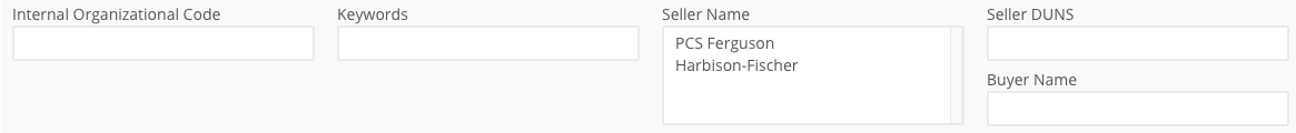
By default the fields of the search form are displayed in 2 columns.
To change this, a per <View> value can be set using the element <SearchDisplayColumns>.
<View>
    <SearchDisplayColumns>3</SearchDisplayColumns>
    <ListOfSearchables/>
 </View>
Furthermore, form field positions can be left empty using the special <Searchable> of <Type> padding.
<ListOfSearchables>
    <Searchable/>
    <Searchable>
        <Name>PADDING1</Name>
        <Description>
            <EN>-</EN>
        </Description>
        <XPath/>
        <Type>Padding</Type>
    </Searchable>
</ListOfSearchables>
<XPath>
The XPath used to evaluate the search of the XML document.
If the <Type> isStringContains and the <XPath> element is repeated the underlying search logic will be changed from an AND to an OR.
For example:
... AND ( xpath1 CONTAINS "Error" OR xpath2 CONTAINS "Error" ) AND ...
<Type>
The available types are:
- StringContains
- RangeOfDates
- RangeOfMillis
- StringEquals
- IStringEquals
- OrgPath
- Flags
- Padding
- InList
Details of the behaviour of each searchable type can be found here
<Default>
This is a default String value that will be placed in the search field. This value is only a default and can be modified or over-typed.
<Choice>
This element contains a comma separated list of possible String values.
The presence of this element causes the text input field to be changed into a combo box control with the given <Choice> values as options.
An empty value (just a comma) is often useful to allow the field to be set to blank or null.
Note
By default the combo box control is editable.
Select multi items
Using additional attributes it is possible to change the standard <Choice> combo box control to a multi-select list control.
This control will allow multiple items to be selected or de-selected.
Often when multiple items are selected, the server processing will require them to be delimited with certain characters.
By default items will be delimited with commas.
More typically for systems with PostgreSql databases the delimiter character should be the pipe |.
For example:
<Searchable>
   <Name>LastStatusCode</Name>
   <Description>
      <EN>Disposition</EN>
      <FR>Code dernier statut</FR>
   </Description>
   <XPath>MessageInfo/LastStatusCode</XPath>
   <Type>StringContains</Type>
   <Default>Rejected</Default>
   <Choice multi-select="true" multi-select-delimiter="|">Rejected,Acknowledged,Error,Sent,Pending</Choice>
</Searchable>
Display a list of choices
When you need to display a list of choices but want to be more descriptive in the list displayed to the user, this element can be used in addition to the <Choice> element.
This comma delimited list contains a display value that corresponds to the query value contained in the <Choice> list.
For example:
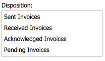
<Searchable>
    <Choice multi-select="true">SNT,REC,ACK,PEND,</Choice>
    <DisplayChoice>Sent Invoices,Received Invoices,Acknowledged Invoices,Pending Invoices</DisplayChoice>
</Searchable>
This will show a multi select choice as follows:
Disallow the typing of custom values
This applies to the none multi-select choice: the combo box control. By default this control is editable. This means that a user can type an additional value for inclusion in a query.
Adding the <Choice> attribute editable="false" will ensure that only those values present in the <Choice> list are selectable.
Restrict the height
By default a multi-select <Choice> will size itself to display all choice options available.
This can cause a list to grow beyond the natural size of the search form.
To restrict the height of a multi select <Choice> control add the multi-select-height="xxx" attribute.
Where xxx is a value typically between 200 and 1000.
Warning
The user will then have to scroll the multi-select-list to access all available values.
Viewable fields
To customize the search response format, you need to edit the view XML definition.
Example of a viewable configuration
<View>
    <ListOfViewables>
        <Viewable>
            <Name>LoadDate</Name>
            <Description>
                <EN>Load Date</EN>
                <FR>Date de création</FR>
            </Description>
            <XPath>MessageInfo/CreationDate</XPath>
            <Type>Date(yyyyMMdd'T'HH:mm:ss.S z)</Type>
        </Viewable>
    </ListOfViewables>
 </View>
Description
Fields that are both searchable and viewable may have different descriptions to accommodate column width. For example, description may be Document Type as searchable but only Doc. Type as viewable, same with Document Number vs. Doc. Number.
The description of SURI typed viewable fields shall not contain the word View or Display but only what they allow to view/download (often Source, Document, Attachment…).
Type
This is a display type inference that is used by a user interface to render the viewable
Supported types are:
- Date([format]) : a JDK date format string. E.g.
yyyy-MM-dd'T'HH:mm:ss.S z - String : a text string
- ReferenceString : text to be used as reference only and not displayed
- URI : a URI
- SURI | SDOC : a
SmartURI/DOC (see below) - Flags : transaction flags (see below)
- I18nStringMap : an i18n Map of Strings
- ItemLink : a link to a transaction (see below)
- WorkflowStep : details of any workflow step that created this transaction
Types may also use the following attributes:
- key : used as additional argument to SURI/SDOC
- hidden : available to the user interface but not to be displayed
Item links
It is possible to create Item links, i.e. the ability to navigate between specific transactions (items, technically speaking) in the Transactions Portal UI.
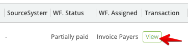
Once a link is created, a View button is automatically displayed in the transactions list and clicking on the button will open the linked message.
In the transaction you want to link from, create an XML element containing the details of the transaction you want to link to, for instance:
<itemlink>
   <view>Customer Portal</view>
   <id>Invoice_Z5931030123_64711a55-f8ed-4919-abbb-2f2961ee8725</id>
</itemlink>
The name of the XML element, itemlink in the example above, does not matter, however this element must contain at least:
- one view element which contains the name of the view which will be used to fetch and display the linked transaction
- one or more id elements which contain the linked transaction ids
The XML configuration of the view of the transaction you link from must contain a viewable of type ItemLink with an XPath pointing to the XML element above.
<Viewable>
    <Name>itemLink</Name>
    <Description>
       <EN>Transaction</EN>
       <FR>Transaction</FR>
    </Description>
    <XPath>/MessageInfo/itemlink</XPath>
    <Type>ItemLink</Type>
</Viewable>
Flags
The XML configuration for the view supporting flags must be updated with a new viewable of type Flags:
<Viewable>
    <Name>Flags</Name>
    <Description>
         <EN>Flags</EN>
         <FR>Flags</FR>
    </Description>
    <XPath>MessageInfo/Flags</XPath>
    <Type>Flags</Type>
</Viewable>
For a transaction to be flagged, the XPath in the viewable must exist in the XML of the transaction.
Thus, to flag existing transaction, all transactions will need to be first reprocessed to insert the appropriate element with an empty JSON Object as value {}, so that they can be flagged.
Smart Views/URIs
Smart View (SURI) refers to the formatting and display of file content referenced via a URI in a Platform 6 document or the Platform 6 document itself.
More information in this section.